Best Composite Door Colours for a North-Facing House
If your front door faces north, most of the colour advice you will find online is quietly useless to you. It was written about timber doors and tins of paint, with a paragraph about what red means for your luck and another about kerb appeal photographed in July sunshine. None of that helps when you are standing on a shaded step in Lancashire in February, looking at a swatch card, trying to work out whether that grey will still look grey.
A north-facing door has genuinely different conditions to deal with: less direct sun, slower drying after rain, cooler and flatter daylight all year round. Those conditions change which colours look right and which finishes stay looking right. Here is what actually matters when the door is a factory-finished composite or uPVC unit rather than something you brush paint onto.
Composite and uPVC colour is a component, not a coating
This is the single biggest difference, and it should change how you make the decision.
A timber door is painted. If the colour is wrong, or the fashion moves on, or the sun bleaches it, you sand it back and paint it again. The colour is a consumable layer sitting on top of the door.
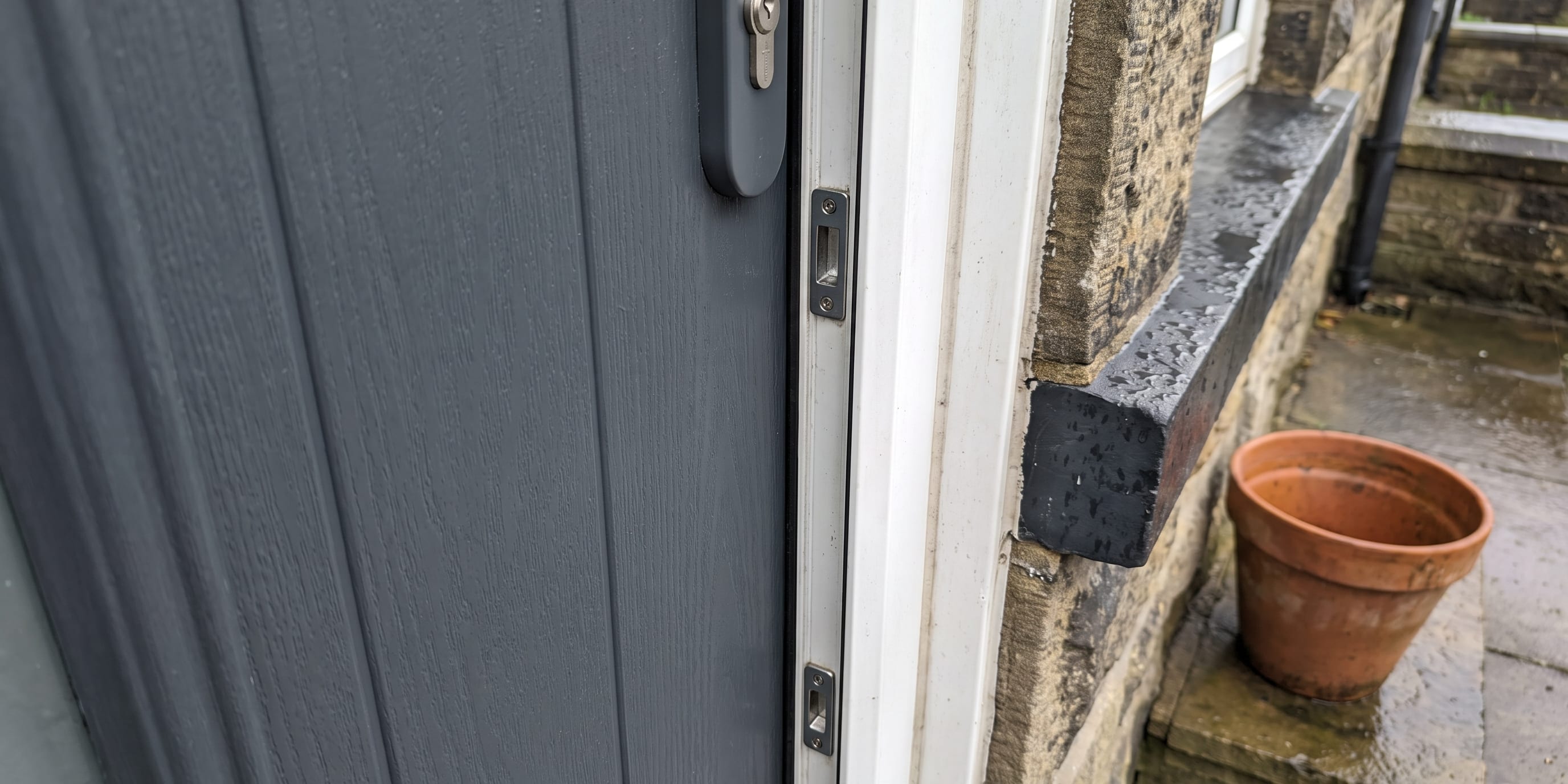
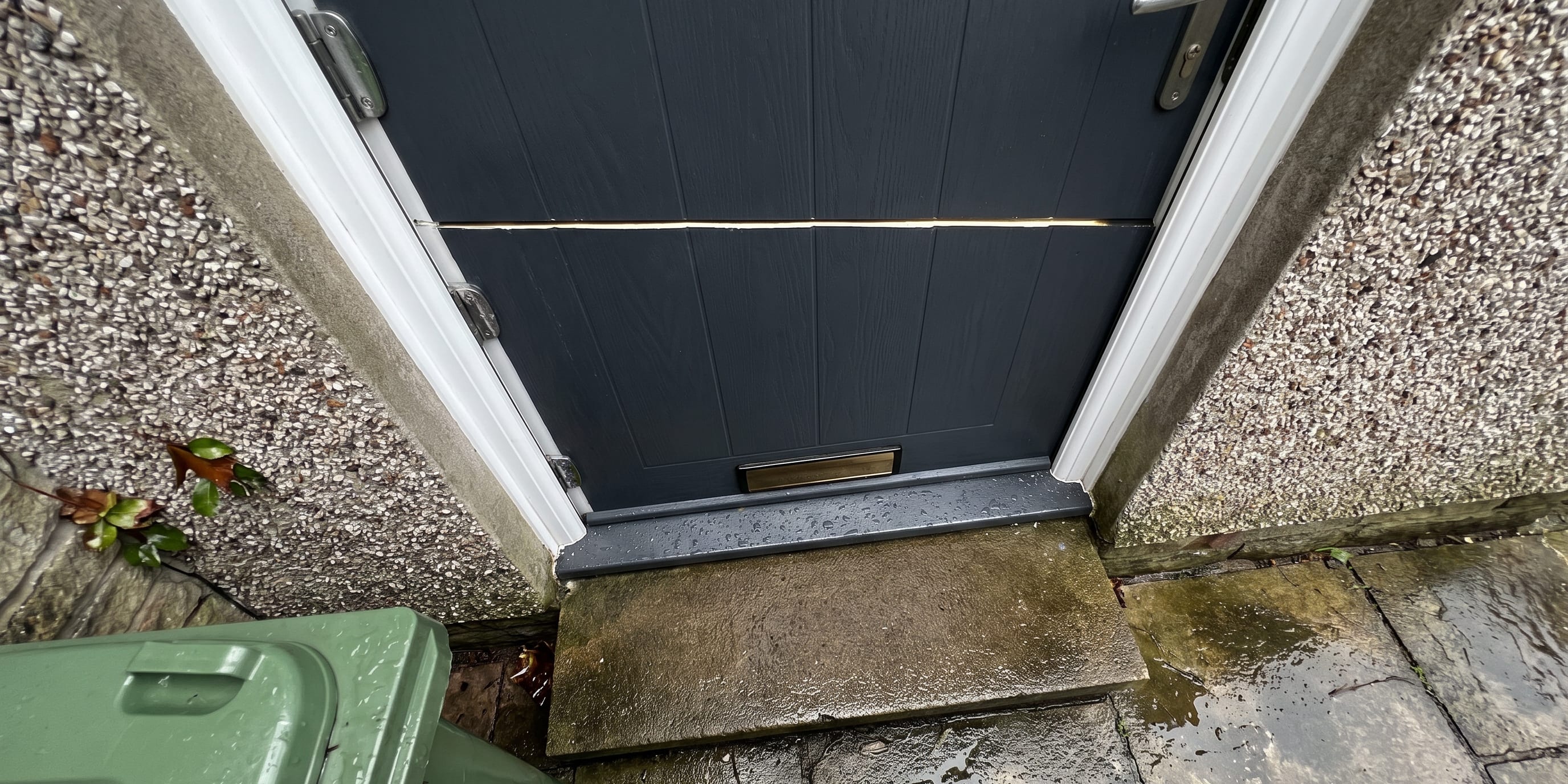
A composite or uPVC door is different. On a composite door, the colour is part of the factory finish applied to the moulded GRP skin before the door ever leaves the plant. On a uPVC door, the colour is usually a foil laminate bonded to the profile under heat and pressure, or a coloured extrusion. Either way, the colour is not a maintenance layer you refresh. It is a property of the door you bought.
Refinishing is not impossible. Specialist sprayers do coat uPVC and composite doors. But it is a proper job with proper cost, it has to be done in situ or off site, and it can have implications for the manufacturer’s finish warranty. Nobody does it lightly, and nobody does it on a whim because they fancied a change.
The practical conclusion: choose for fifteen years, not for this season. A colour that looks bold and current on a showroom stand in bright light is a different proposition on a shaded north elevation you will walk up to every day for the rest of the time you live there. This is one of the reasons we prefer to show samples at the house rather than in a showroom. The light where the door will live is the only light that counts.
The real north-facing problem is not sun. It is damp.
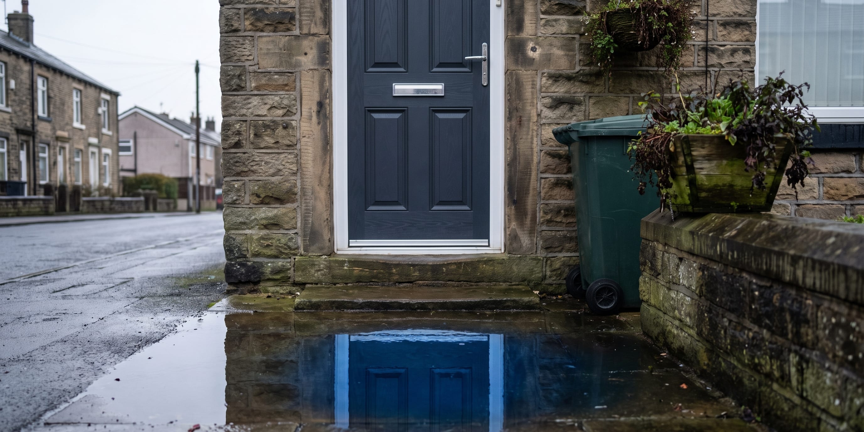
North elevations in the north west take very little direct sunlight, and what they do get is low and brief. The wall and the door stay cooler. Rain and overnight dew sit on the surface longer before they evaporate. If there is a hedge, a porch, a neighbouring gable or a tree anywhere near the frontage, the drying slows down further.
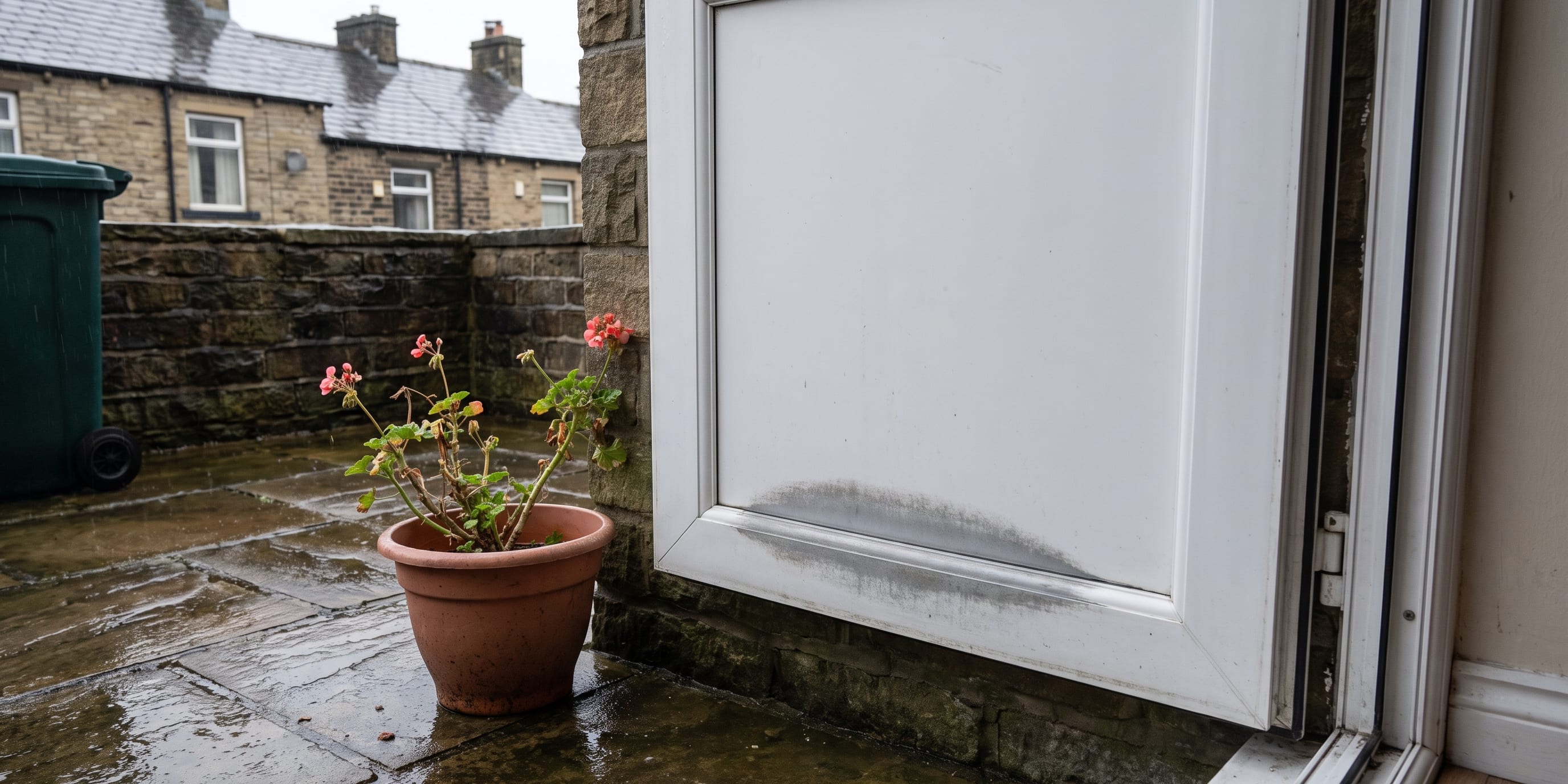
Slow drying plus a cool surface is exactly what airborne algae, mould and lichen spores want. That is why north-facing render goes green before south-facing render, why the north side of a fence post is the furry one, and why a north-facing door can develop a faint greenish or greyish film across its face and frame within a couple of years, particularly along the bottom rail and inside the rebates where water lingers.
None of this damages a composite or uPVC door. The finish is not organic, the growth sits on the surface, and warm soapy water and a soft cloth take it off. The issue is purely cosmetic: some colours make it invisible until you wipe the door, and some colours announce it from the pavement.
Colours that disguise it well: anthracite grey, slate and graphite greys, chartwell green and darker heritage greens, black, and darker blues. Green growth against a green or grey door is close to unreadable at a distance. Woodgrain finishes in rosewood or darker oak tones are similarly forgiving because the surface already has tonal variation.
Colours that show it early: brilliant white, cream, ivory, and very pale pastels. A white door on a shaded north elevation is not a mistake, plenty of them look excellent, but you are signing up to a wipe down a couple of times a year rather than a cursory one every so often.
If somebody in the house is not able to get out and clean the door face regularly, that is a real argument for the darker end of the palette on a north aspect.
UV fade works in your favour here
Fade is caused by ultraviolet light breaking down pigment over time, and the amount of UV a door receives depends overwhelmingly on how much direct sun hits it.
A south or west-facing door takes hours of high-intensity direct sun, and west is often the harshest because the door is taking the strongest afternoon light at the point in the day when the surface is already warmest. On those elevations, deep reds, strong blues and some greens have historically been the finishes most likely to show change over many years.
A north-facing door receives diffuse skylight rather than direct beam for most of the year. It still gets UV, because daylight always carries some, but it gets far less of it. That genuinely widens your options. If you have been talking yourself out of a strong colour because you are worried it will go chalky, a north elevation is the aspect where that worry is least justified.
The flip side is worth saying plainly: if you have a north-facing front door and a west-facing back door in the same colour, they may not age at identical rates over a long period. That is physics, not a defect.
Colours that actually read well in flat northern light
North light is cool and even. It has no warmth to bounce back at you and no hard shadow to give a surface drama. That does three things to colour.
It mutes warm colours. Creams, warm reds, golden oaks and honey tones lose the glow that makes them work in sunshine and can read slightly flat or muddy, especially against red brick.
It flatters cool colours. Greys, blues and blue-greens sit beautifully in flat light. They look intentional rather than accidental. This is why anthracite grey has become such a default on shaded modern frontages, and it deserves the reputation.
It reduces contrast. Mid-tones can disappear against a similarly toned wall. Going darker than you first think is usually the right call on a north elevation, because you need the door to hold its own without sunlight doing any of the work.
Against Lancashire’s common exteriors, that plays out fairly predictably. On red brick terraces and semis, anthracite grey, black and chartwell green all give you the cool counterweight the warm brick needs. On buff and honey sandstone, which is a warmer and softer backdrop, chartwell green and darker heritage blues look settled, and black can be very smart on stone with dark reveals. On white or pale grey render and pebbledash, anthracite grey and black give the crispest definition, and a green softens the effect if a hard contrast feels too severe. On newer mixed multi brick, grey and black are the safe reads, and a deep blue can lift an otherwise plain frontage.
Woodgrain or smooth: how texture behaves without sun
This choice matters more on a north-facing door than people expect, and it matters in the opposite direction to the usual assumption.
In strong direct sunlight, a heavy woodgrain texture can look busy, because the light catches every ridge and the grain reads as a pattern printed on the surface. In flat north light there is no hard raking sun to do that. The texture picks up soft gradations instead, which is much closer to how real timber looks. A woodgrain composite skin on a shaded elevation tends to read as depth and substance rather than as an imitation.
A smooth or matt finish does the opposite. It reads as a single clean plane, which is precisely the point on a contemporary frontage, but in low indirect light it can look quite flat and can show surface marks, handprints and water spotting a little more obviously on darker colours. Matt anthracite on a north elevation looks superb and modern, and it does want wiping over now and then to stay looking that way.
Neither is better. If the house is traditional, a period terrace or an older stone property, woodgrain will generally sit more comfortably. If the house is a newer build or has been given a contemporary treatment, smooth or matt will look deliberate. The thing to avoid is choosing a texture from a photograph taken in bright sun and assuming it will look the same on your shaded step.
Choosing it properly, at the house
Colour is the part of a door order that people most often regret and least often get a second attempt at. It is worth twenty minutes of looking at real samples against your own brick, in your own light, on the elevation the door will actually sit on. A swatch held against a sunlit wall tells you very little about a door that will spend its life in shade.
That is how we do it. We bring samples to you, look at the aspect, the brickwork and the surrounding frontage, talk through the trade-offs above, and leave you with a written price you can read at your own pace. No salesman sitting in your kitchen waiting for a decision, no discount that expires at nine o’clock, and no attempt to price a door over the phone when we have not seen the opening.
If you are weighing up colours and finishes, have a look through the range, and then book a home visit for a written price on Win-Door Fit’s composite front doors and we will bring the samples to your door.
Questions
Frequently Asked Questions
Do dark doors fade faster on a north-facing house?
Fade is driven by ultraviolet light, and a north-facing elevation receives far less direct sun than a south or west one. A dark anthracite or black door is at lower fade risk on a north wall than on a west-facing one that takes the full afternoon sun. Diffuse daylight still carries UV, so quality of finish matters, but north is the kindest aspect for strong colours.
Which door colours hide green algae staining best?
Mid to dark greens and greys tend to disguise the green or black tinge that builds up on shaded, damp elevations. Chartwell green and anthracite grey are forgiving. Bright white, cream and very pale finishes show it first, though all of them clean off easily with warm soapy water.
Can I repaint a composite or uPVC door later if I get bored of the colour?
Not in the way you would repaint a timber door. The colour is part of the factory finish, either a coated GRP skin or a bonded foil laminate. Specialist spray refinishing exists, but it is a proper job with cost and warranty implications, so it is better to choose a colour you will still be happy with in fifteen years.
Does a woodgrain texture work on a north-facing door?
Yes, and often better than you would expect. Soft north light picks up surface texture gently rather than blowing it out, so a woodgrain skin reads as depth rather than pattern. A smooth or matt finish looks flatter and more contemporary in the same light.
How do I choose a colour that suits Lancashire red brick?
Red brick sits well with anthracite grey, black, chartwell green and darker heritage blues, because those colours are cool enough to balance the warmth of the brick. Very warm creams and light oaks can look muddy against red brick, particularly on a shaded frontage.